We share our inquisitive musings.
Working with Swiss Standard German text as a British designer
My time at on-IDLE so far has not only taught me a lot about working in a studio, but also a fair amount about Switzerland and Swiss culture. For instance, I can now name three Swiss cantons and I have succeeded in retaining eye contact while clinking a glass, without causing a glass-related hand injury.
Following the British stereotype, my modern language skills are very limited (however, very limited in three!). A lot of projects at on-IDLE have presented me with the challenge of working with a lot of Swiss Standard German text, in particular in Migros projects. Although daunting to begin with, there are indeed advantages to this. One is that spotting double spaces and checking the dashes is a lot easier, as you are not worrying about spotting typos, or getting distracted by what the text is saying. Secondly, I have found myself beginning to develop a slight understanding of the written language, with a particular notice to punctuation, which is something my Duolingo app hasn’t shown me! This post shall be a summary of what I have worked out so far.

Dashes
What came to me quite quickly is that if you are working with Swiss Standard German, you are probably going to be also working with hyphenated text. My guess is that it is due to the length of a lot of the words in the language, in order to avoid horrendous rags, especially in multiple columned layouts.
If you have read past posts on the on-IDLE blog, you would be aware of Marc’s rants about em and en dashes, but there is a rule not found in English grammar, which permits time in the limelight for the hyphen when paired with a few certain words. The case I have most commonly witnessed is ‘- und’. There are other instances that I spotted in the Aare Magazin for Migros, which include ‘- oder’ ‘- bis’ and ‘- als’. So, it seems that conjunction words are permitted the use of a hyphen.
An example of this can be:
«Sie stiften Orientierung im Einkaufs- und Informations- dschungel.»
Quotation Marks
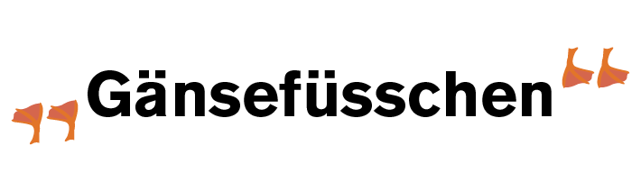
‘Guillemets’ (« ») can often be found in Swiss Standard German text, as a replacement for the English quotation marks. Although Guillemets are used in many languages, they are often referred to as ‘French quotation marks’, so it was probably something that hopped over the border. Upon discussing this with Sabina, I discovered that this typographic mark is mostly used within print. There is an alternative used for handwritten text, are called Gänsefüsschen („“), which cutely translates as ‘Geese Tootsies’.
The use of Guillemets however, is considered superior by some designers, as it creates less blank space in comparison to quotation marks. As well as this, they provide a greater distinction from commas, apostrophes etc.
Numbers
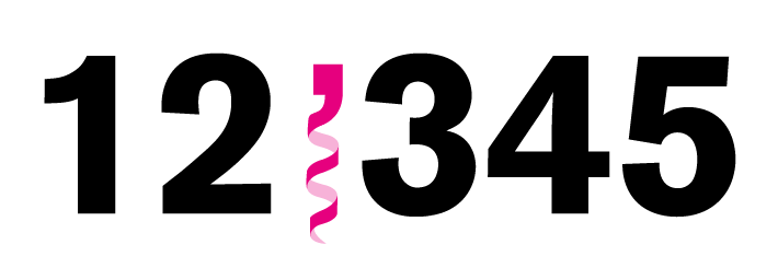
The rule in the English language when writing numbers consisting of more than three digits a comma is used to separate every third number from the right (i.e. 1,489). Swiss Standard German also uses a thousand separator in most cases, but an apostrophe (’) is used instead. Of course, there is a correct apostrophe – a closing single quote mark and it has to be the curly one. Most certainly can it not be a straight quote (which came from the use of typewriters) or a prime (the unit used for inches and feet).
Dates
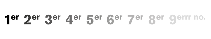
Through updating the warehouse construction images on the Guntensperger Cheese website, I learnt that when writing the date using the ‘little endian form’ (i.e. 27th September 2017), the suffix is replaced by a dot (ie. 27. September 2017). I figured that the reasoning behind could be because every number would otherwise end with ‘er’, which I suppose could get quite tedious.

Eszett (ß)
A big difference between the written language in Germany and Switzerland is the lack of the ‘scharfes S’ (or ‘Eszett’) which translates in English to ‘Sharp S’. The Eszett in German comes in several variations, which can be interchanged according to typographic preference, in order to control the space around the letterform. It originally did not come in a capitalised form, as it was never used at the beginning of a word. However, as of 2017, it is officially represented as ?.
It is thought that there are several possible reasons why the Swiss rejected the Eszett. One is in connection to the objection to Nazi Germany, in order to distinguish itself from the country. However, it may have been simply due to the confusing rules attached to the letterform. Whatever it was, the dismissal of the letterform was aided by the struggles with the Swiss keyboard, as a lot of space had been used to accommodate the glyphs for the French speaking cantons. The letter was last used in Switzerland by a newspaper in 1974 after years of gradual decline, and is now represented by ‘ss’.
If you wish to acquire obscure and overly geeky historic knowledge of typographic marks and punctuation, I highly recommend the book ‘Shady Characters: The Secret Life of Punctuation, Symbols & Other Typographic Marks’ by Keith Houston. The cover also feels pretty nice.
You may also like...
How to turn a photograph into a digital watercolour on Photoshop – People often say there’s no replacing traditional media with digital techniques, but when you’re hunting through stock images trying to find the perfect one, sometimes there’s no other option.
read more →
Jost Hochuli: Printed Matter – A week before starting my placement at on-IDLE, I got my hands on a copy of the recently republished ‘Detail in typography’ by Jost Hochuli. I had no idea that I would have the chance to shake his hand only three months later.
read more →