We share our inquisitive musings.
Jost Hochuli: Printed Matter
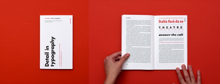
A week before starting my placement at on-IDLE, I got my hands on a copy of the recently republished ‘Detail in typography’ by Jost Hochuli (1987) during a visit to Amsterdam. ‘This little book is concerned with those questions of typography that can be considered as belonging to the area of micro- or detail- typography… These are the components that graphic or typographic designers like to neglect.’ The Jost Hochuli philosophy is that books can be beautiful but they are foremost made to be read and must consistently be functional. I stared at it with wonder on the ferry home (consequently, when I have viewed his work over the past couple of weeks I am reminded of that journey). My relationship with typography is as up and down as the sea was that afternoon and I wished I had seen this book years ago. I liked that he mentioned Roman letterforms – one of my true loves. I had no idea that I would have the chance to shake his hand only three months later.
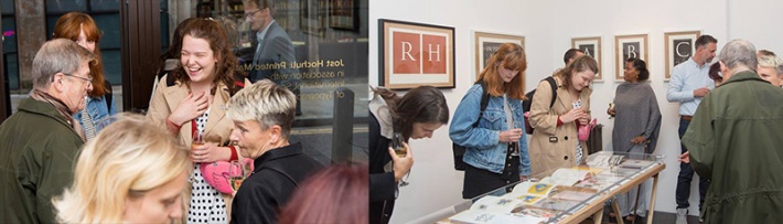
We were all lucky to be guests at the private view of the exhibition; Jost Hochuli: Printed matter, at the Umlaut gallery – a selection of work from Jost’s personal collection. This is because Sabina, Marc and Ané were involved with planning it alongside Freda Sack FISTD, Ambit and the Swiss cultural fund. It was interesting to observe the craft involved in the curation of the exhibition. Watching Sabina and Freda run in and out of the studio with books and frames and hearing all the conversations about arranging and hanging was interesting.
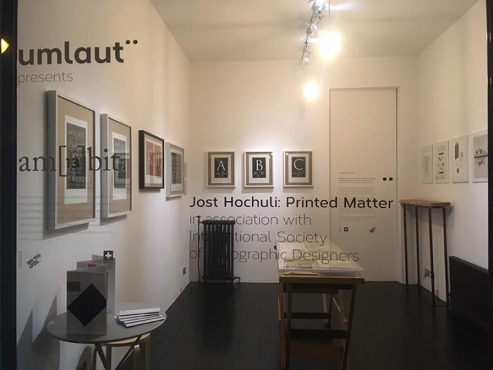
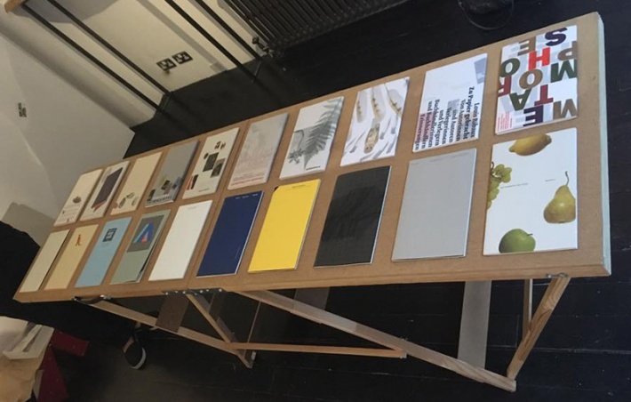
The Umlaut gallery is a small space, however the way that the work was arranged made it feel intimate and engaging rather than claustrophobic and cluttered. One of my favourite parts of the exhibition was an elegant book about Insects. I also loved the striking bright yellow cover of the book ‘Rightness and lightness’ with a dark top left corner, up close you could see that this was a hand cut out rather than a printed detail.
We got talking to Ian Mortimer OBE, printer and close friend of Jost, who also gave an impromptu speech. He marvelled at the displayed Beechwood cut prints, admiring the sophistication demonstrated in their production. ‘Typography is the presentation of words’ he said, declaring that he didn’t wish to condescend his audience, but I hadn’t heard somebody say this before it was refreshing.
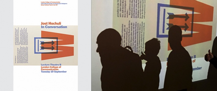
On Tuesday 19th September, Jost visited London to give a talk called; Jost Hochuli in conversation. Jade and I arrived at the LCC ahead of the event to assist Freda with the set up. We perched by the door, ticking attendees off the guest list as they arrived and handing them a yellow ticket, that enabled entry to the lecture theatre and a raffle with a chance to win one of the last two available copies of ‘Book design in Switzerland’ (1 Jan 1993) by Jost Hochuli. I think the lucky winner is yet to be announced – whoever you are I’m very jealous of you.
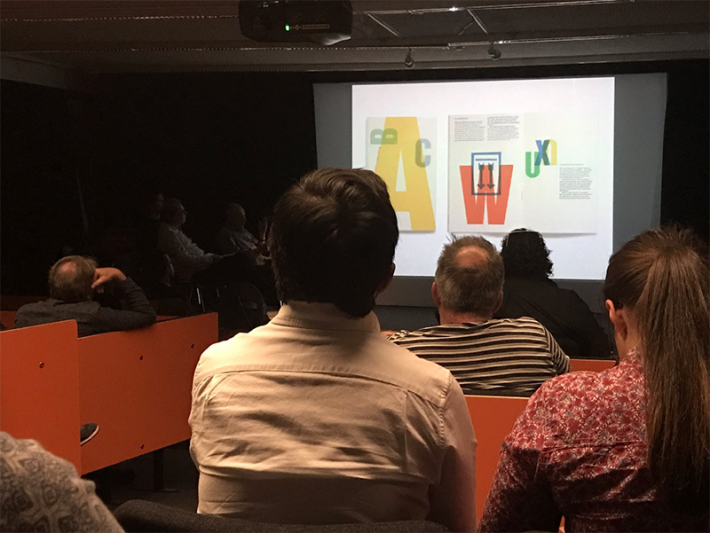
Then we listened whilst Tony Pritchard, FISTD and acclaimed Graphic design tutor, interviewed Jost about his ideology and inspiration. The conversation worked in harmony with the items on display at the Umlaut as it provided a rich context to his pieces.
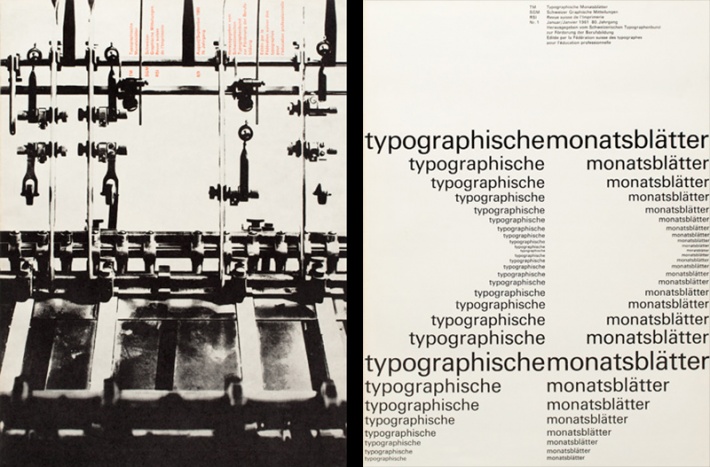
‘If he thought you had done something well he would tell you’ said Jost in tribute to his tutor Rudolph Hostettler who was the editor of Typografische Monatsblätter, an important journal documenting Swiss typography, for 30 years. He explained that when he was young, the only method of becoming a designer or typographer was via an Apprenticeship. When he first started out in the 1950s, all type had to be black, set in Monotype 213, Akzidenz Grotesk or Bodoni and nothing else. Although Jost went on to be an admirer and expert of Jan Tschichold, he described the general Swiss designer’s contempt for his early work and also the moment when he decided that Tschichold was a good typographer. ‘You could frame this page and put it on the wall’.
Another highlight was a series of spreads from the Swiss Protestant and Catholic Hymn books both designed by the same person. These were exemplary because the legibility of text is tested in the poorly lit conditions of a church. I had never considered studying the design of sheet music before despite being surrounded by it often.
The talk concluded with a story that when Jost was a child his ambition was to become a forester, but instead ‘was lucky enough to marry [Ursula] the daughter of a forester’. He clarified that he still enjoys being close to nature saying ‘With each step, a part of your life is done’.
Lastly, we went for a drink at the Prince Albert pub nearby, ‘What would the collective noun for a group of designers be?’ wondered Ané, I’ve thought about this since but I can’t think of a decent one. It’s hard to think of things that are simple and clever.
You may also like...

Working with Swiss Standard German text as a British designer – A guide to typographic and punctuation rules in Swiss text.
read more →