Women-Up! | Branding, Stationery & Website
_
Problem: Women working in the Swiss corporate environment, inevitably hit a 'glass ceiling' when wanting to move into C-suit or directorial roles. Women-Up! is a network founded to coach, teach and network with women to give them the tools they need to achieve their potential. Only the name was a given in the brief. A full brand identity and all brand touch point outputs needed to be designed.
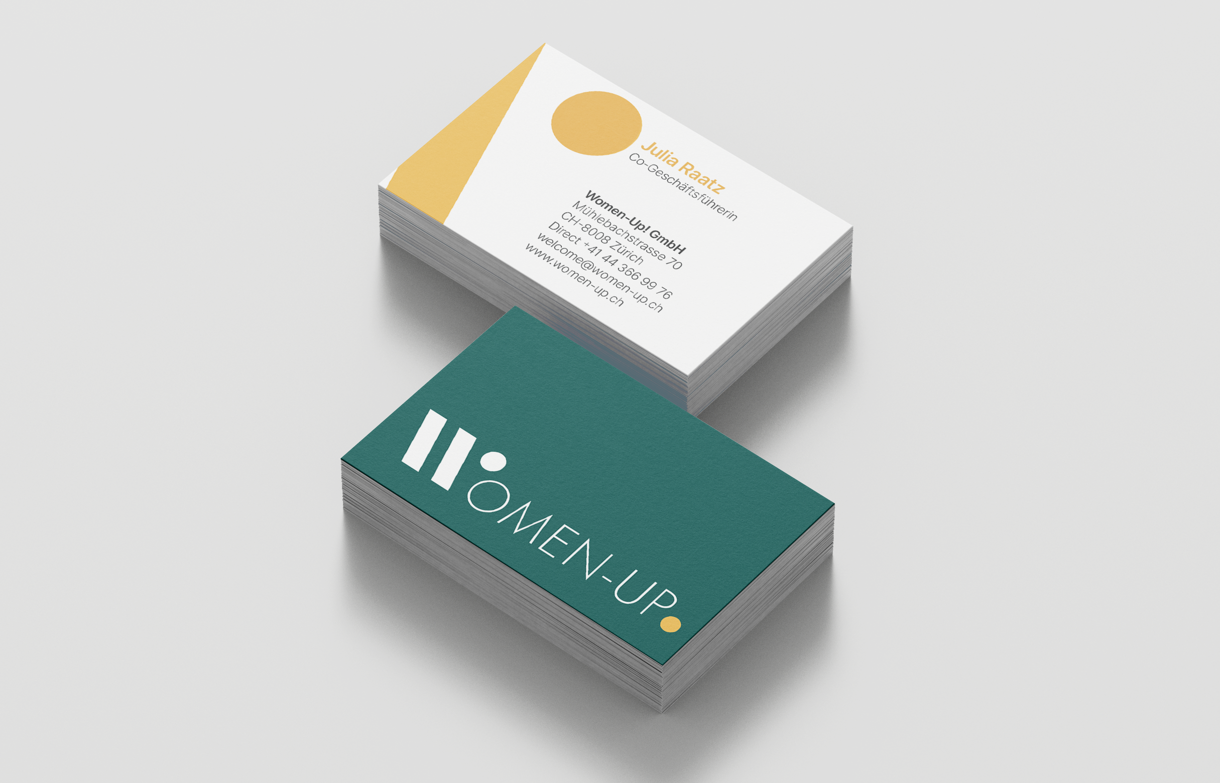
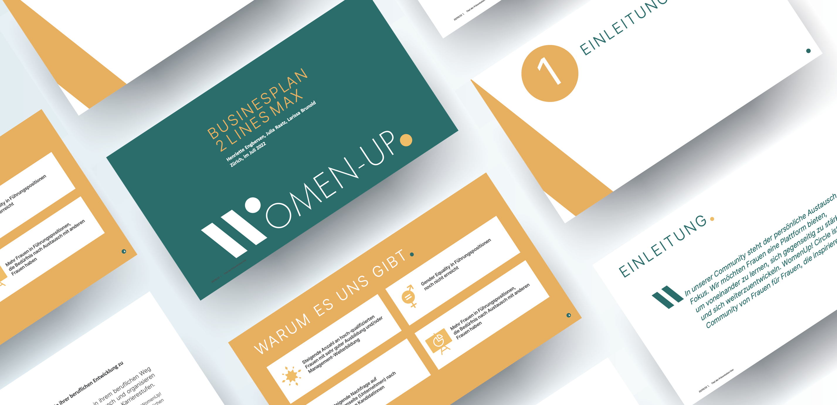
Solution: The design of a fully unique brand identity including the concept, logotype, colour-ways, unique image language, typographic styling and tone of voice. The outputs realised as a lead generation website (recruiting of new members to join the network), social media assets (header banners and avatars), iconography set for services offered, presentation deck, email signatures and business cards.
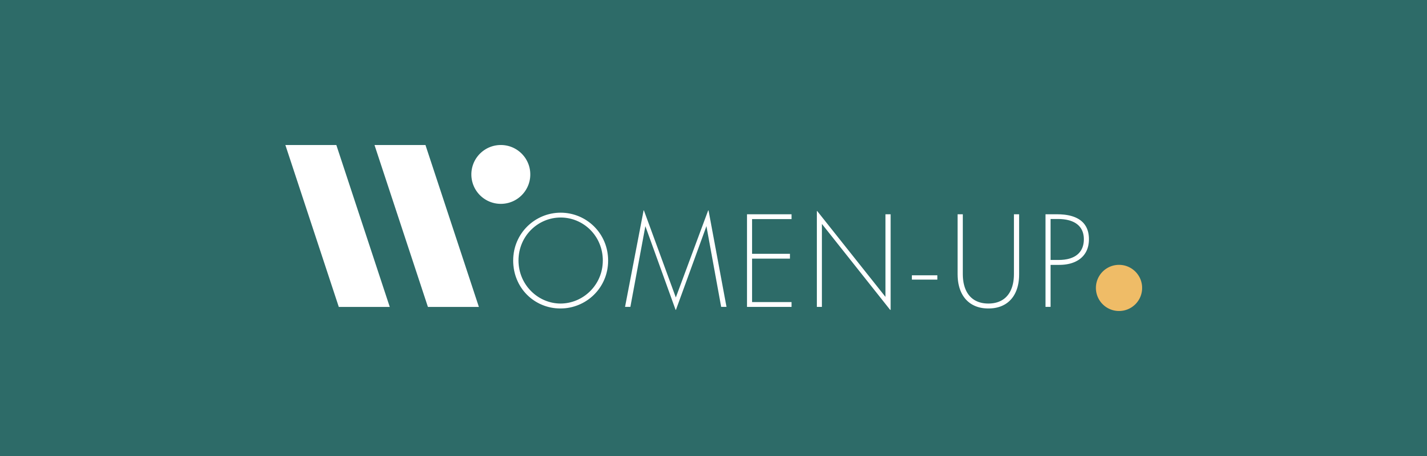
Highlight: Our favourite kind of project – creating a whole identity from concept to execution. The logotype is a particular source of joy, using the 'dot' as a playful device to draw attention and reinforce the dynamism at the centre of the network.

_
The website is the most important brand touchpoint and it was for all involved clear from the start – after our extensive research – that we want to be different, work with type & colour, not be overtly feminine and not look like a cookie-cutter template website.
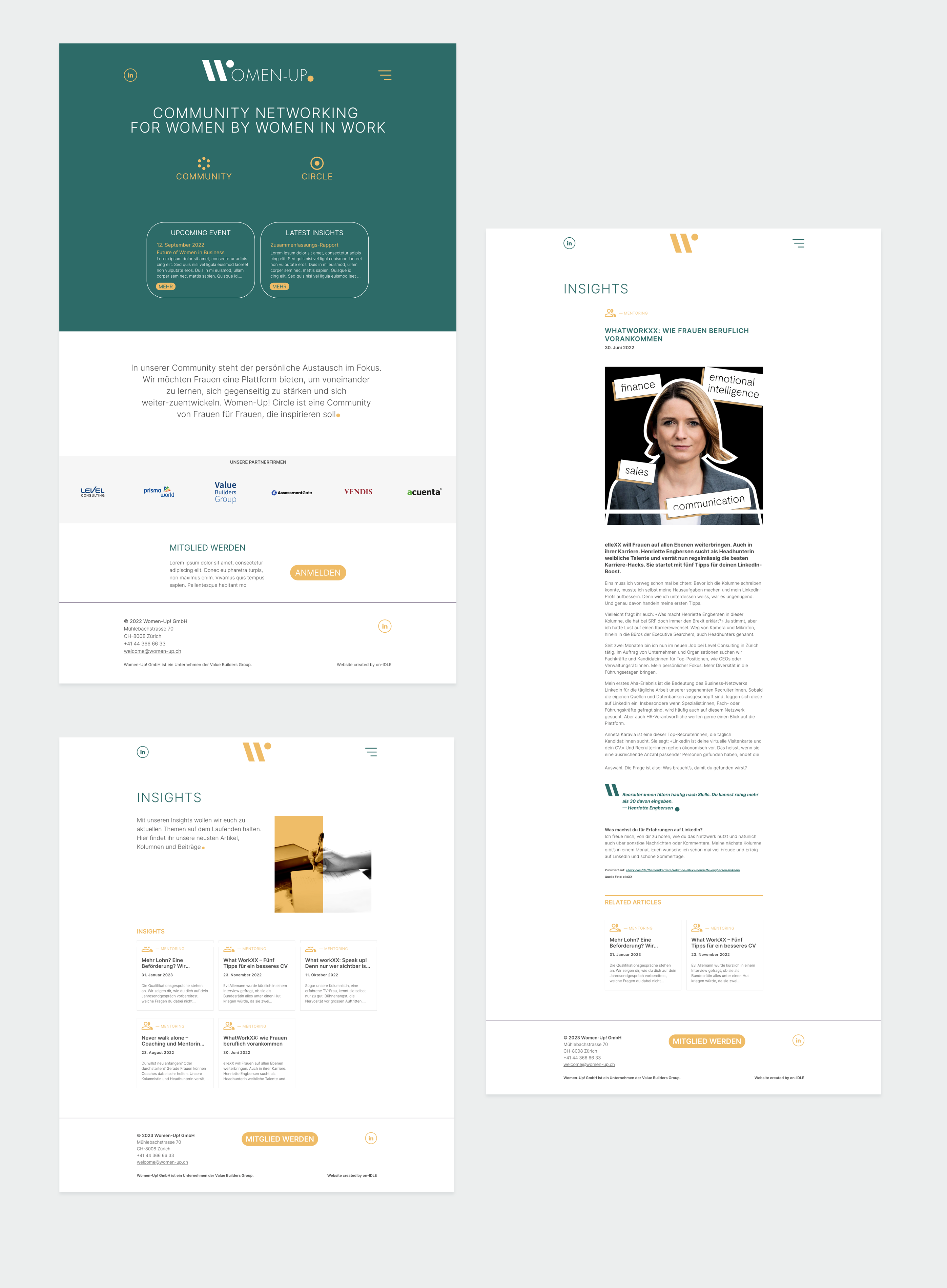
_
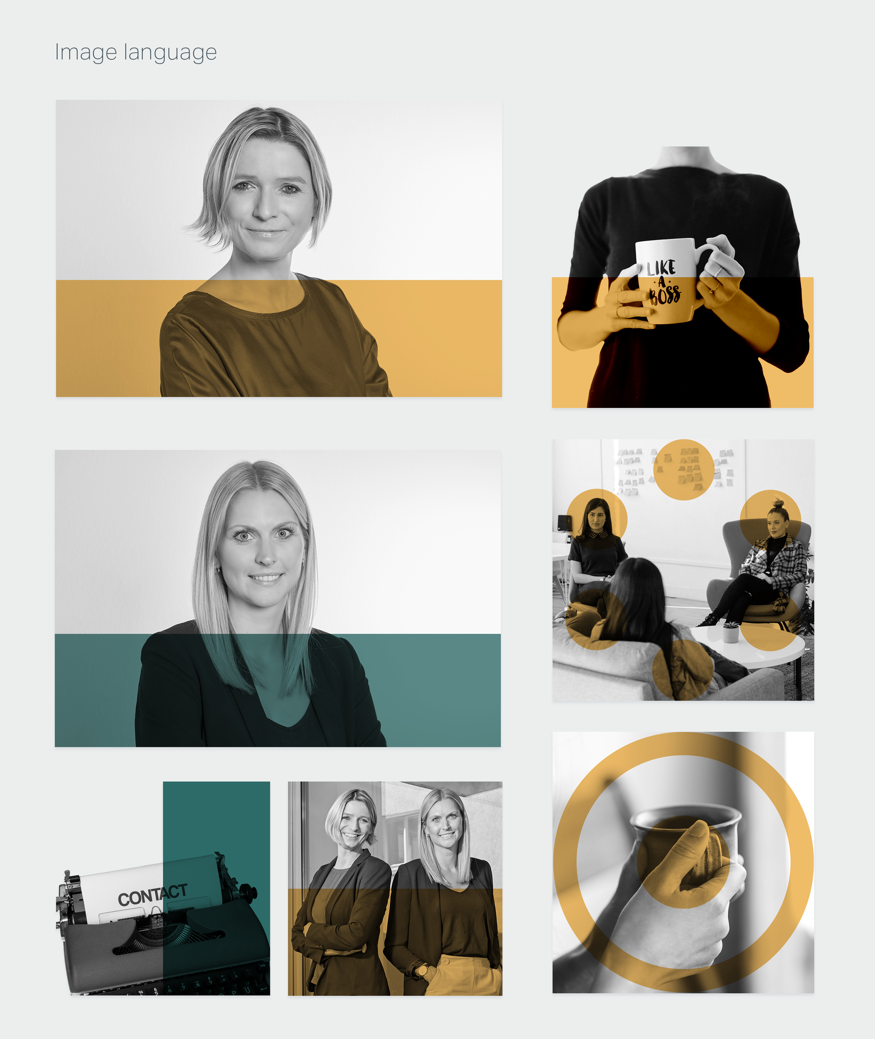
The image language was created to add a dynamic element in a move away from 'stock imagery' of people in work. The bespoke image style is black & white with parts overlaid in one of the brand colours.
_
Included in the delivered outputs, was not only the website design and development, but stand alone logo files for the client to use in office applications, business cards and a presentation deck.
_
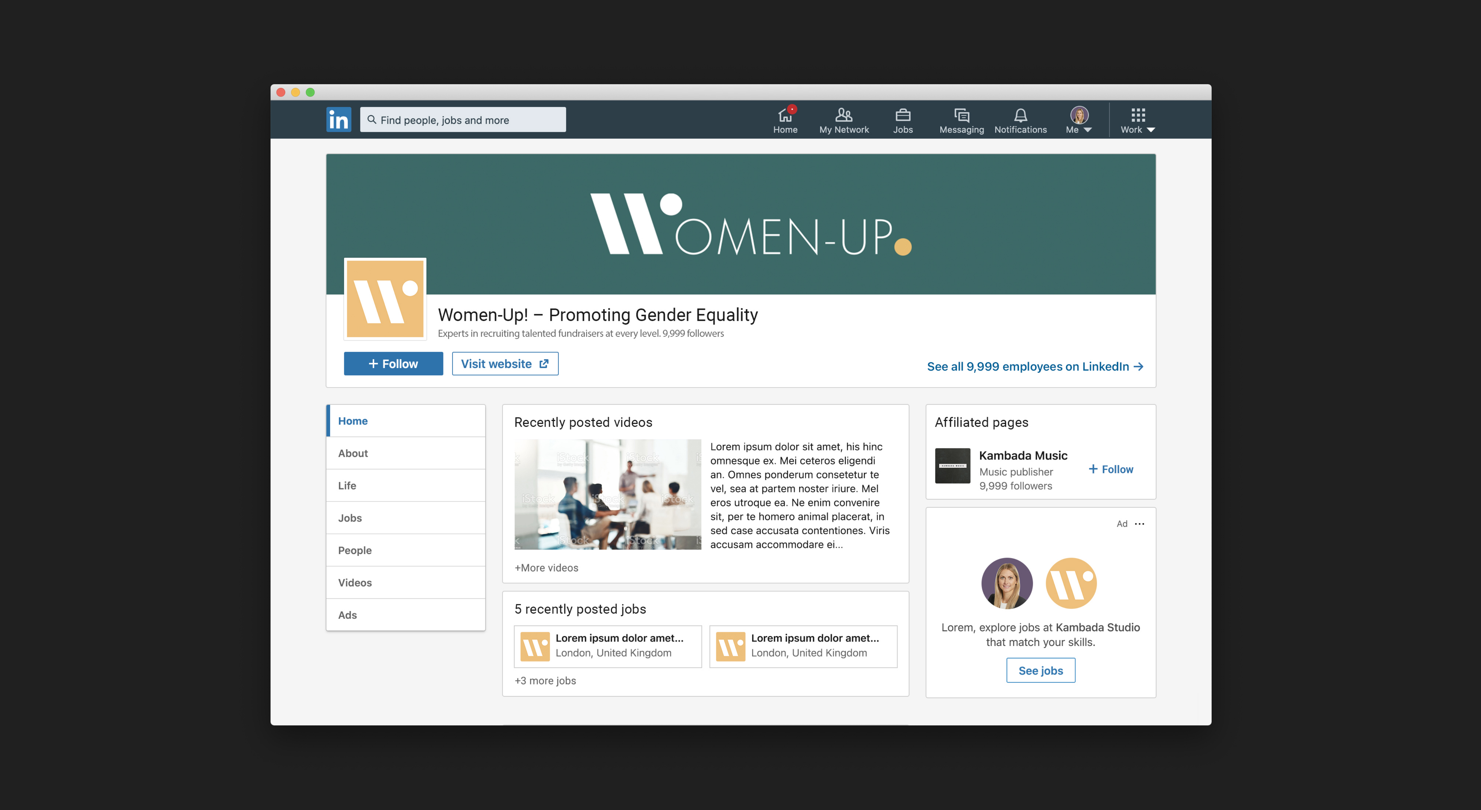
In the wild on the launch day it was very exciting to go to LinkedIn and then see the design applied not only to the business page, but as well the founders on their personal profiles.