_
Pontoniere Aarburg | Event Brand Identity & Poster Design
Pontoniere Aarburg | Event Brand Identity & Poster Design
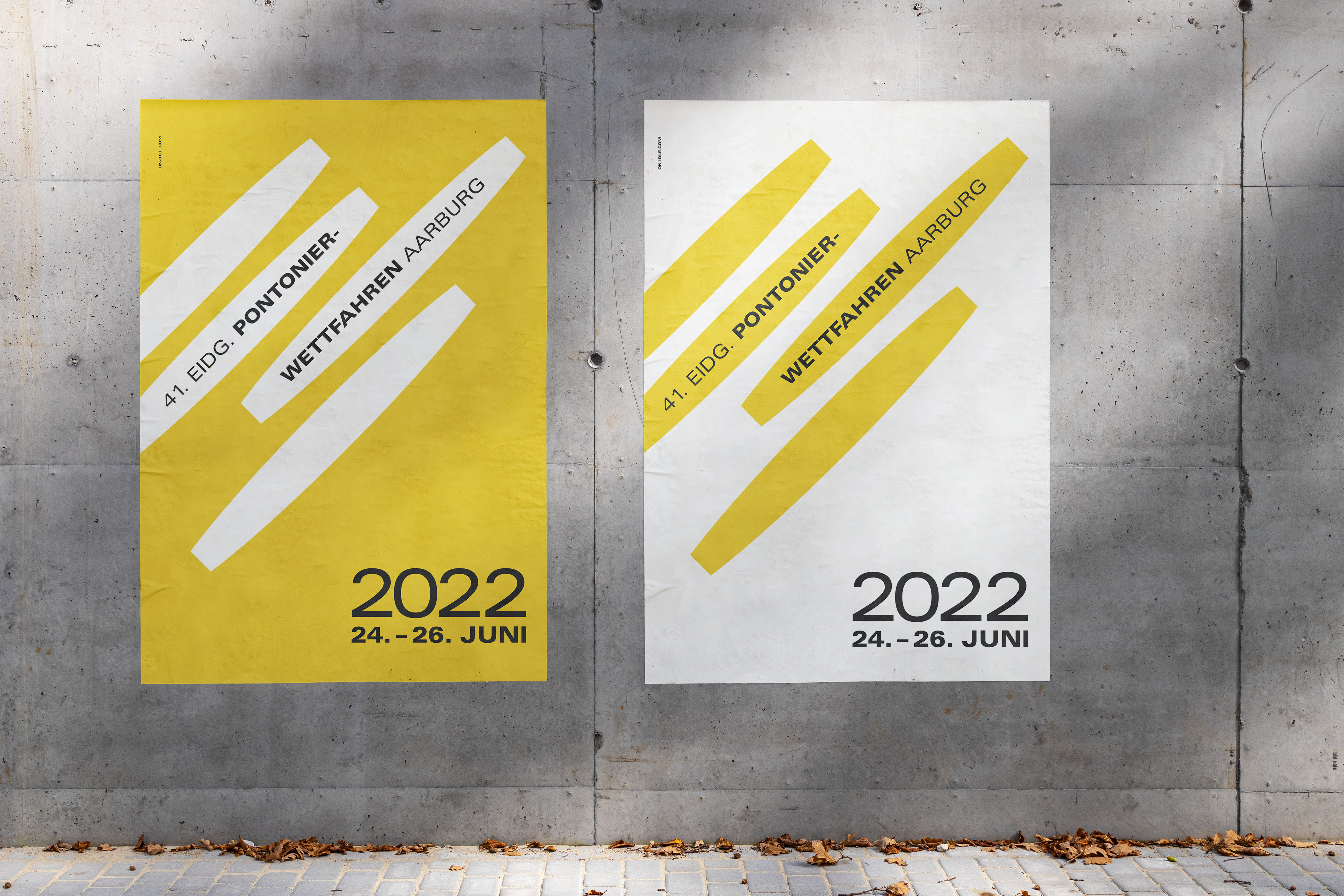
Problem: The 41st national pontoon race taking place in Aarburg, Switzerland needed a captivating identity to mark the 4-yearly event. The identity needed to represent skill and agility, with an element of fun for the family-friendly event. The poster design was required to be highly visible, as part of a broader Switzerland-wide marketing campaign.
Solution: Taking inspiration from Swiss design and Olympic icons, a minimal but playful graphic was developed, featuring the shape of the pontoon boat in an active formation. This icon was then used as the key element of the event’s visual identity.
Highlight: Finally seeing the posters and accompanying brand outputs out in the wild – after two years of festival postponements due to the Covid pandemic.

_
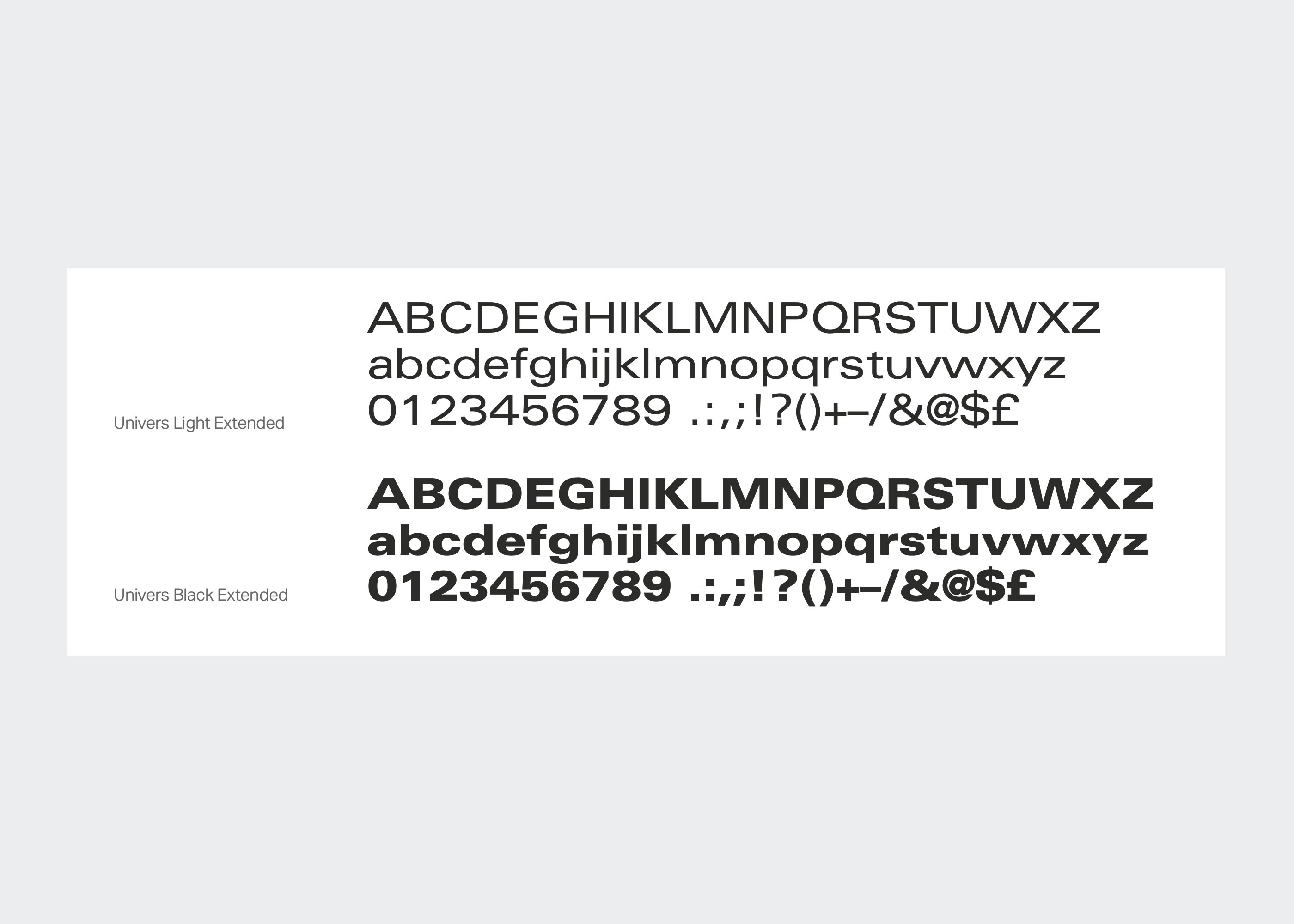
An iconic Swiss typeface – designed by Adrian Frutiger – selected for the illustration of movement and speed and for its readability from afar.
_
The bright yellow borrowed from the hosting team’s colour reinforces fun in an eye-catching way

_
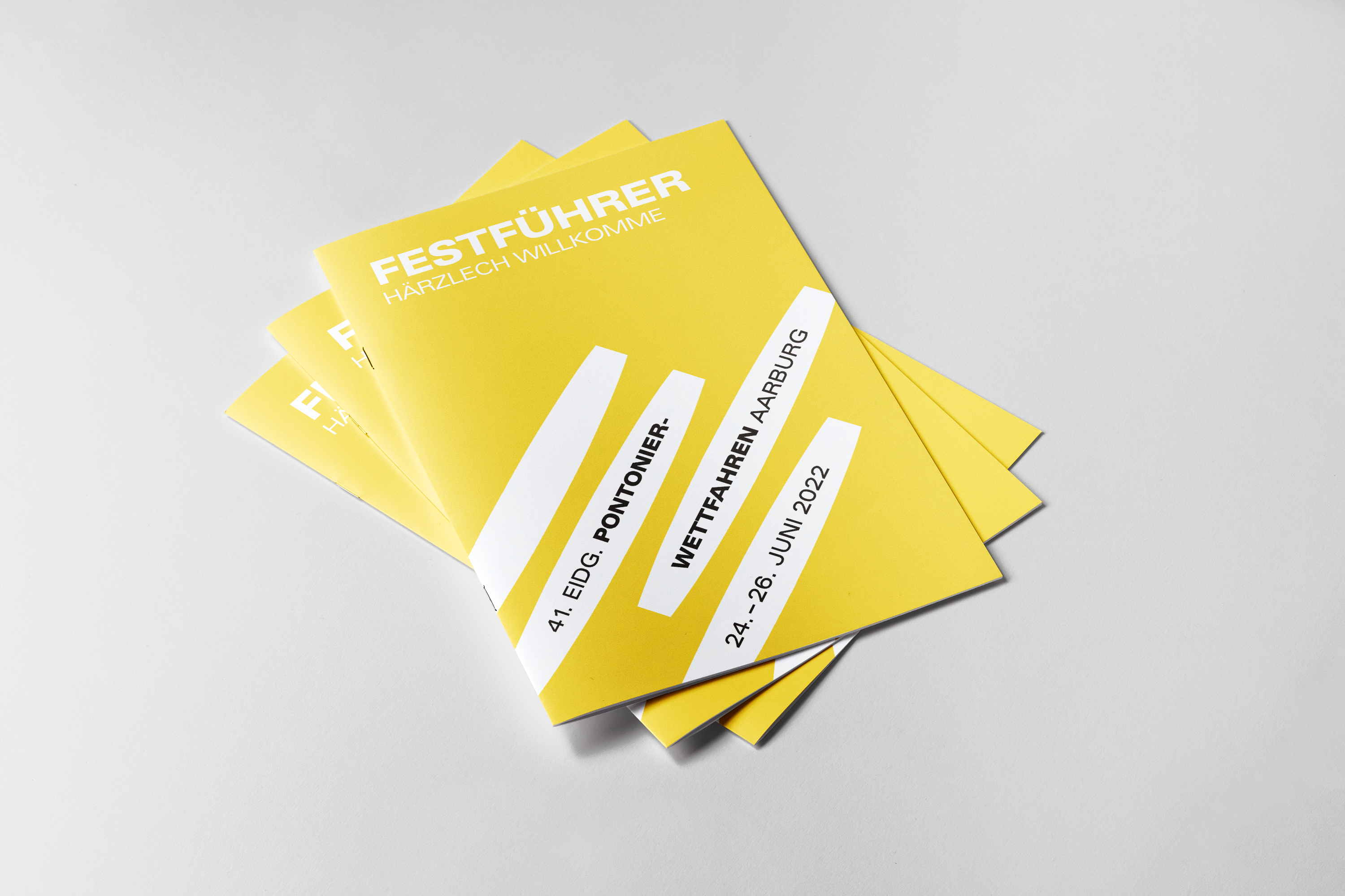
Various brand outputs accompany the main logo and poster design


_
The Kranz (wreath) is a popular collectible item among the Pontoniers and a key part of the event


_
In the Wild
