_
Migros | Restaurant Branding
Migros | Restaurant Branding
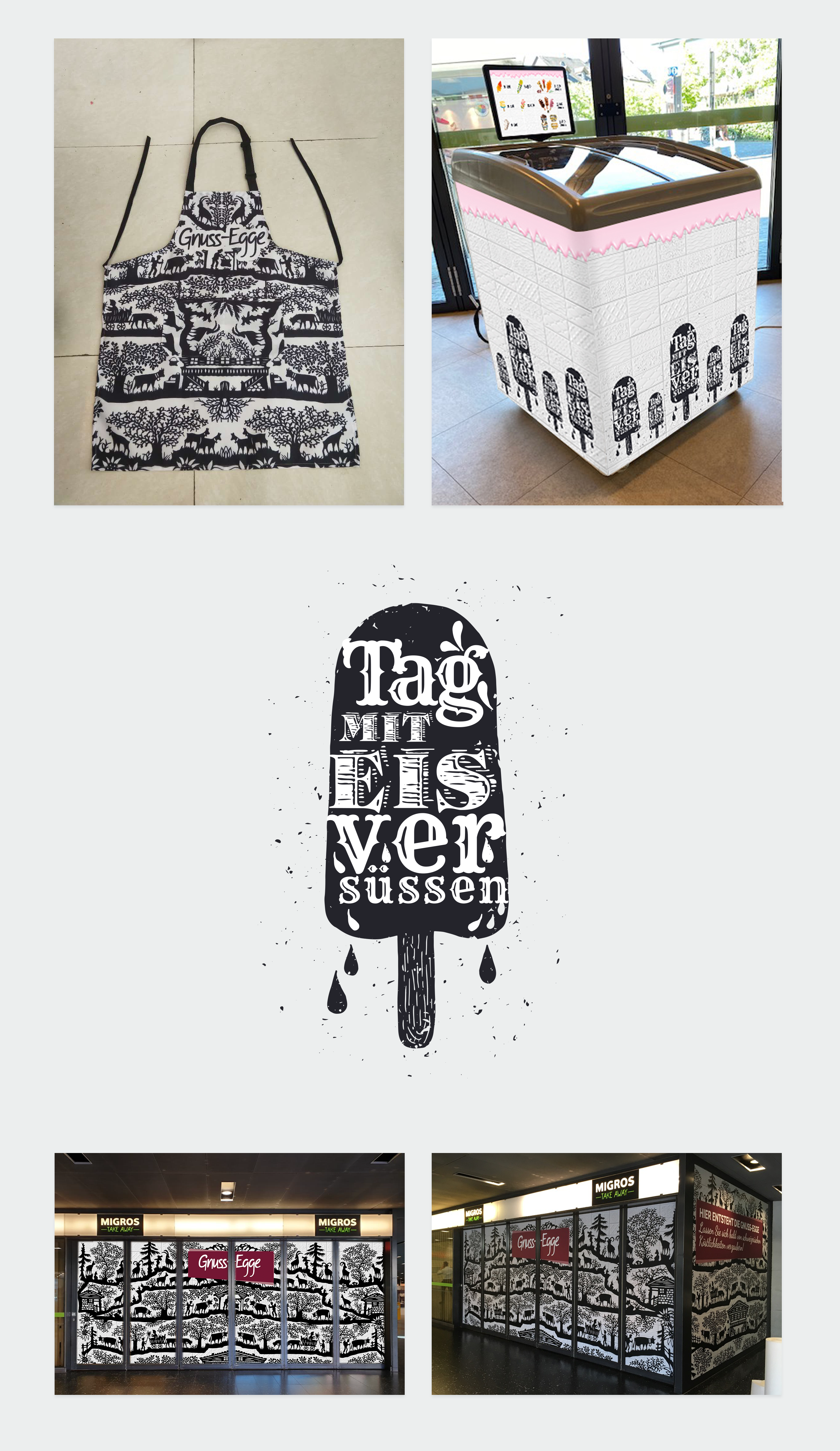
Problem: Our long standing client, Migros needed a new ’urchiges’ (rustic) concept for the take away stores within multiple shopping centres. Gnuss-Egge translates to Enjoyment Corner. With the advent of digital daily menus the branding had to carry through including the custom software in place. The primary aim was to not only have a cohesive brand look-and-feel, but also to negate the need for printed materials in line with the overall greening environmental ambition.
Solution: The use of the typical Swiss "Scherenschnitt" (paper cut) Black & White formed the overall base of the identity, enhanced by the contrast of a dark red Swiss Cross. A nice challenge was to evaluate the font sizing of the menu display screens behind the servers, so that the consumers standing in line could read and place orders quickly.
Highlight: Many conversations with the signage printer to achieve the perfect labelling around the curved edges of the ice cream fridge.

_
The Brand Manual includes every touch point to guarantee future continuity and brand consistency across multiple locations.
The Brand Manual includes every touch point to guarantee future continuity and brand consistency across multiple locations.

_