Migros Fitness Club | Corporate Identity & Touchpoints
_
Problem: Migros Aare has various fitness labels, and Fitness Club was in need of a brand refresh to bring it to harmony alongside the rest of the ‘Fitness Family’.
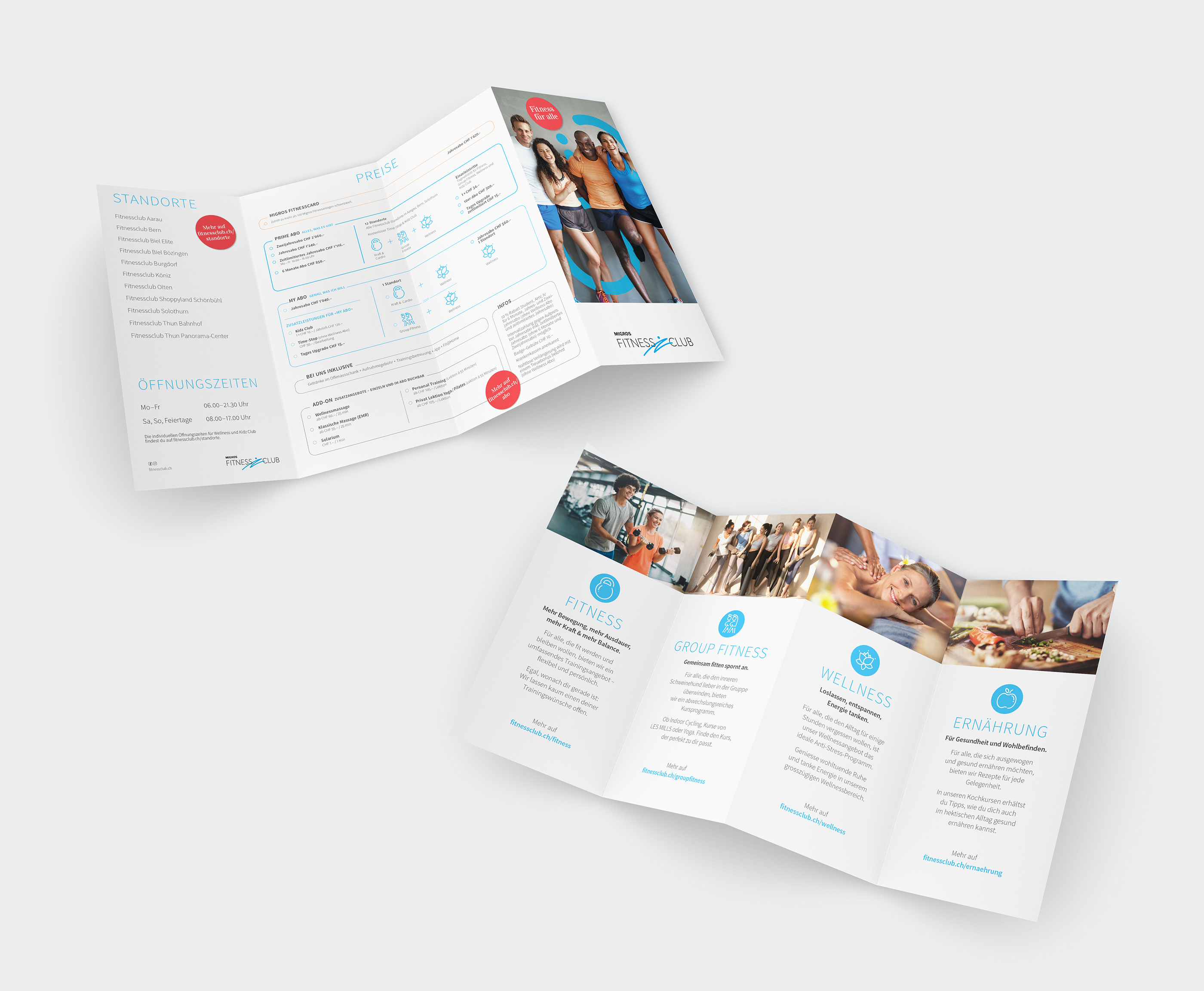
Solution: The brand positioning was developed by the specialist agency Hotz Consulting, which was a fabulous co-working opportunity. We were commissioned to execute the design on all offline touch-points, as well as defining the Corporate Identity Manual used by the whole Migros in-house design team.
Highlight: To be involved in the whole process of the opening of the Bern centre from all the signage, to clothing, to labelling the fitness devices.


_
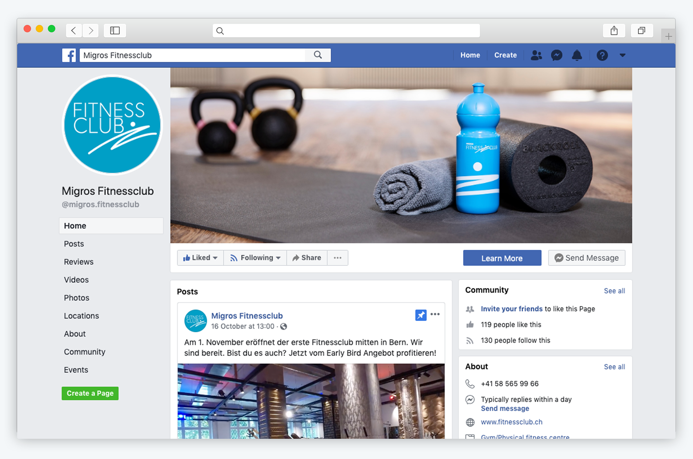
The fitness centre in Bern has some very special interior colours, so it was decided that the brand would be adapted to fit the location using gold and dark brown. These colours are specific to Bern and all the other 11 branches of Migros Fitness Club use the standard blue and white brand colours.


_
Launch campaign
_
In the wild
