_
Grade Design | Website Design
Grade Design | Website Design
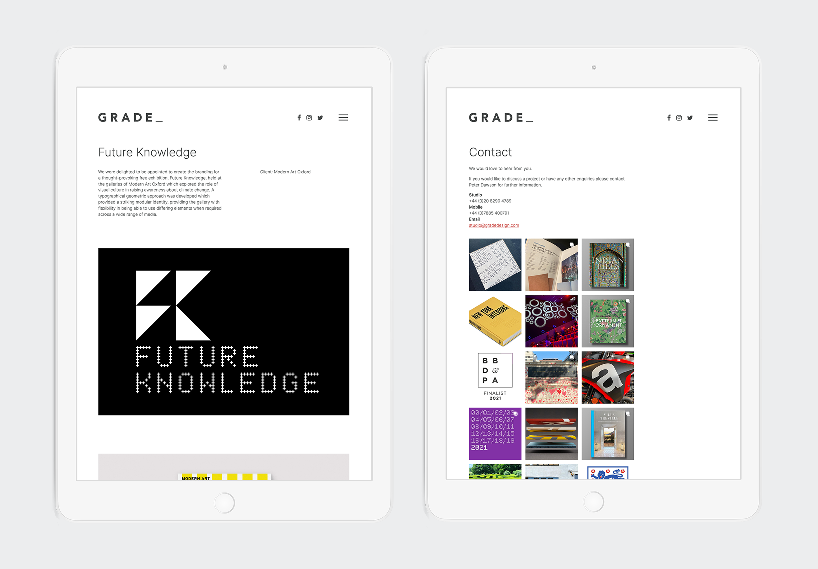
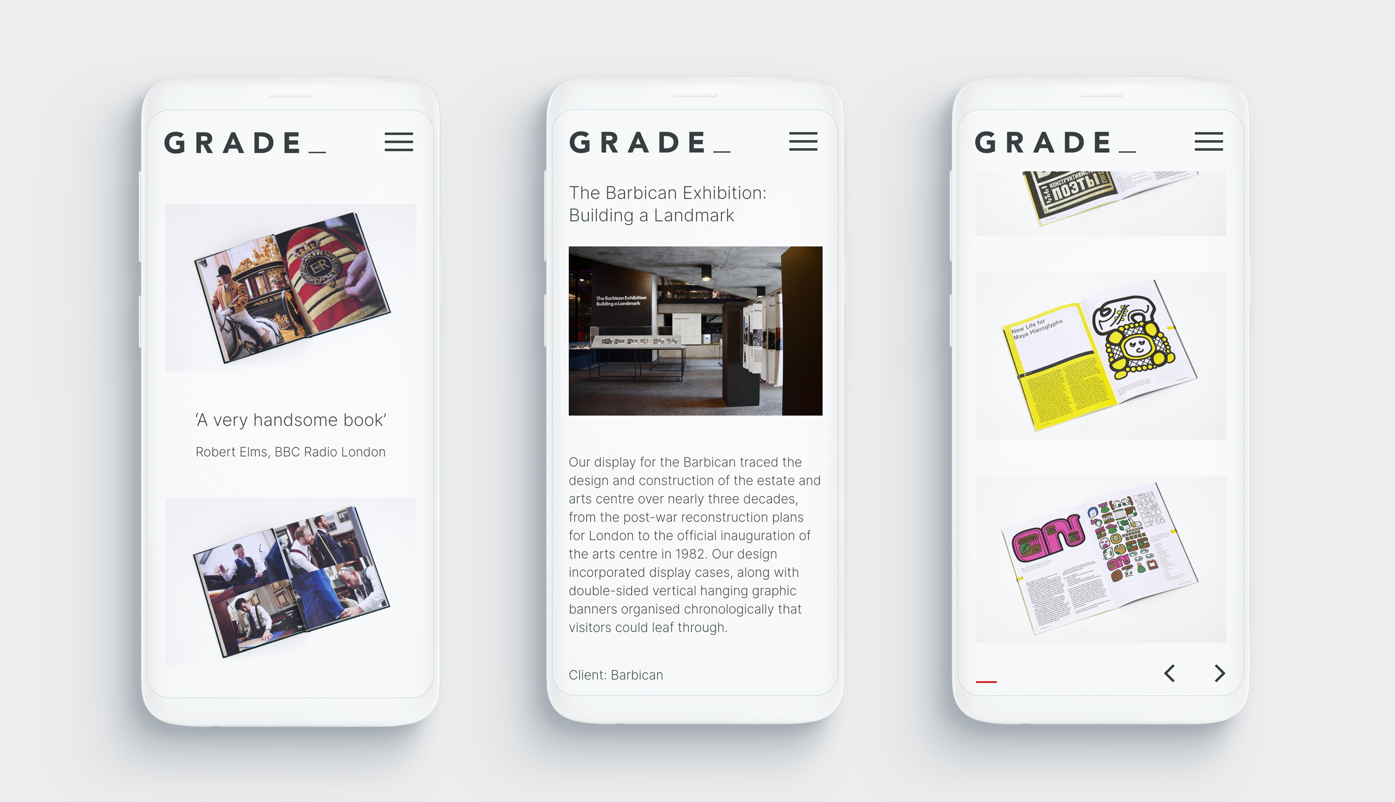
Problem: Grade Design wanted to collaborate on a new website design, to refresh the one on-IDLE designed in 2006. The main requirement of the brief was that the design was to be simple, clean and image-based to show off the meticulously designed and photographed books.
Solution: A website design using a fluid grid that utilises two font sizes and two colours to keep the attention on the book designs themselves. The design also works for Grades other kinds of work, such as identity and exhibition design.
Highlight: The images are so crisp at all screen sizes, that you can read the text within the images very clearly, all while still having fast loading speeds!

_
Fluid grid and automatic optimisation of images according to screen size.
Fluid grid and automatic optimisation of images according to screen size.
_
Overview pages controlled by the menu order in the CMS.

_
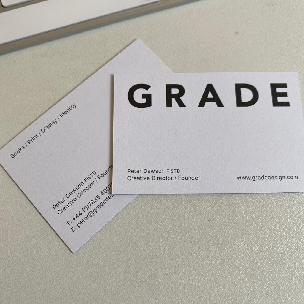
In the wild – The client was so happy with our font suggestion, that he is now using it as well for print design.